




Sinister Wisdom Newsletter
Login (ONLY for SW staff)


A Speculative History of the Sinister Wisdom Typography
By Julie R. Enszer
View previous newsletters and subscribe to the Sinister Snapshot!
If you look closely at the typography for the title Sinister Wisdom, you will see that there have been a lot of different typefaces used to render its name. For example, Sinister Wisdom 4 has a hand-lettered rendering of the name.

Sinister Wisdom 17 through 21 and Sinister Wisdom 26 all have a chunky, all-caps and bold rendering of the name.

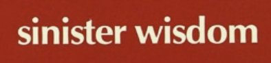
Many of the issues published during Elana Dykewomon’s editorship (1987-1994) use the lowercase rendering of the name, as you can see for Sinister Wisdom 35 through 60.
Beginning with Sinister Wisdom 87, the current presentation of the name begins. I began editing the journal with Sinister Wisdom 81 and used the template from editor Fran Day. Six issues into my work, I designed the new rendering of the name on my computer. It uses Bodoni 72 Oldstyle as the title font. The tagline, “A Multicultural Lesbian Literary & Art Journal,” is set in the font Eurostile. Why did I make those choices? Quite simply, they pleased me. Although if you look closely at the font used for the name, you will note that it echoes with other presentations of the name in the past.
The presentation of the name that intrigues people the most—and is a throwback to our 1970s roots—is the stylization of Sinister Wisdom on the cover of Sinister Wisdom 3, which also features the iconic photograph by Tee Corinne.
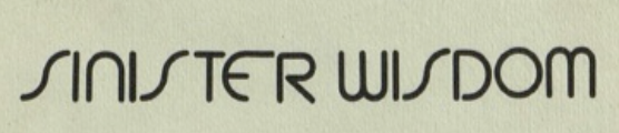
This rendering of Sinister Wisdom appears in Sinister Wisdom 5 through 13 and returns in Sinister Wisdom 15. It is also in Sinister Wisdom 27, 28, and 31. It was clearly a favorite among the early editors.
From what I can tell, this is not a font that is currently in use anywhere. (We would be delighted to find it though if it is an active font!) My speculation is that someone designed and printed this rendering of the name, and it was pasted on the cover for Sinister Wisdom 3, then reused, that is, literally ripped and repasted, onto the covers for the other issues.
The current Sinister Wisdom fundraising committee is looking at that font presentation of the name and exploring how we might use it in our contemporary work.
What Sinister Wisdom font and presentation is your favorite? What meanings do you read into the covers and typeface of Sinister Wisdom as she evolves over the years?
Julie R. Enszer is the editor of Sinister Wisdom.
Continue reading the Featurette on the Sinister Wisdom Blog!
"Empowerment comes from ideas."
― Charlene Carruthers
"Your silence will not protect you."
— Tourmaline
"Gender is the poetry each of us makes out of the language we are taught."
— Leila Raven
Add new comment